Web / UI

Vael: Gaming Website Concept

Overview

Showcasing a happy blend of gaming and web capabilities.

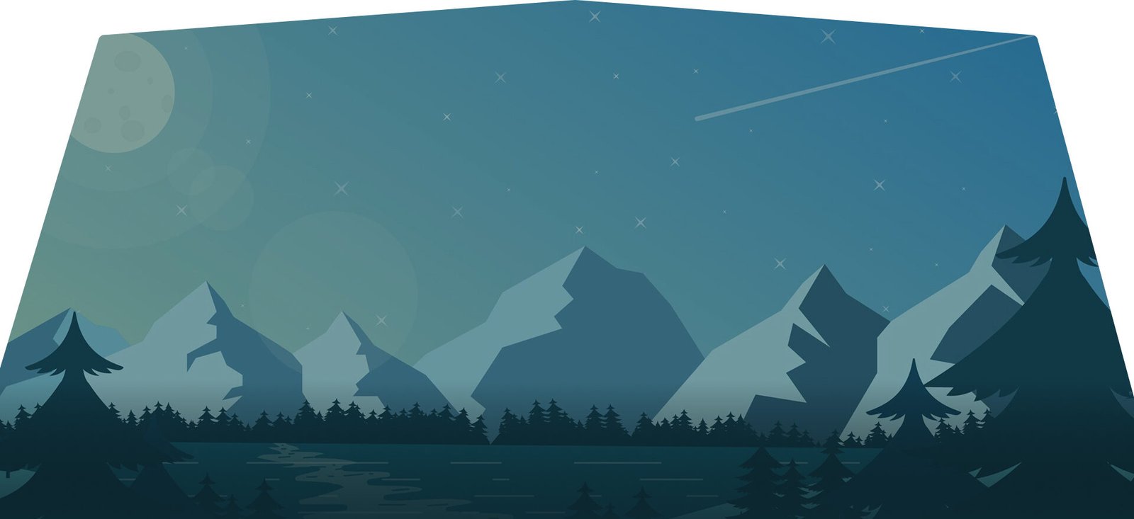
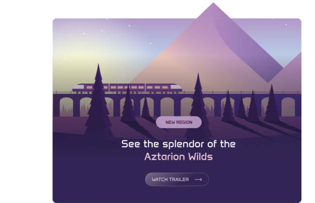
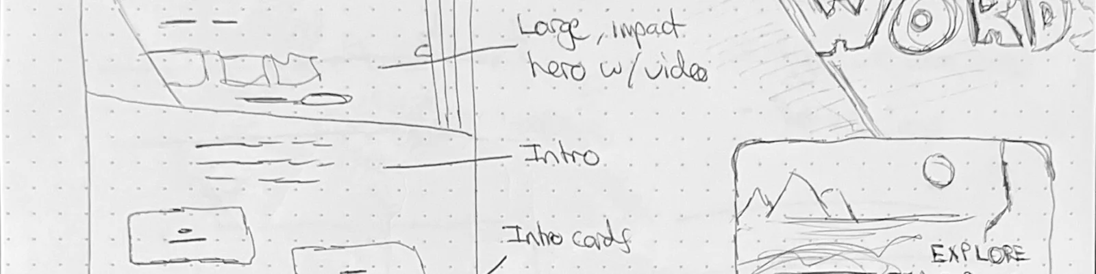
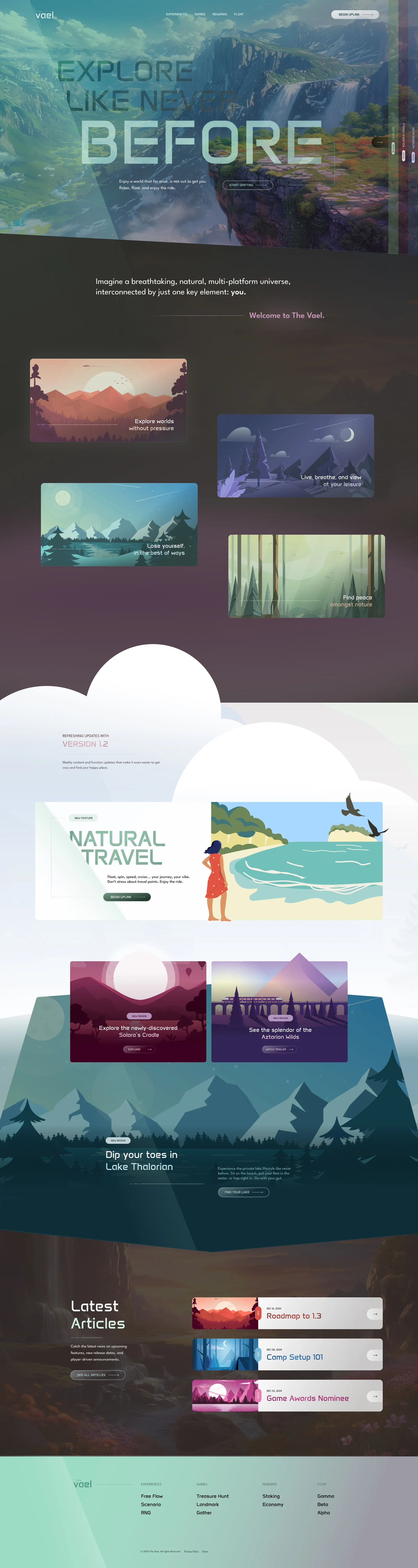
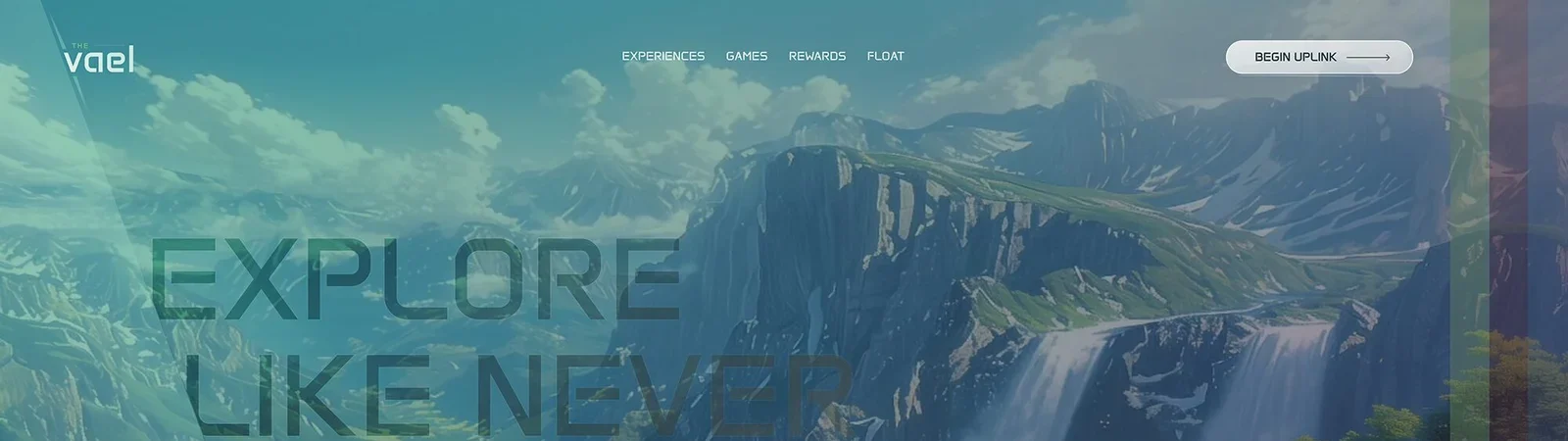
With the majority of my historical experience being in web, but my current focus being on gaming, I wanted to craft a case study that combined the two into a portrayal of vision and capability in terms of UI. This led to a fictional game world that allowed me that opportunity: The Vael. A world that allows for you to experience it, without being in combat, and without: finding peace, exploration, or simply a moment of still. What better way for me to build UI elements that would carry over into an in-game interface, while demonstrating story, flow, and general web understanding.

This was a fun one. Step through some of my project intentions below.

Project Intention

Create an impactful presentation

The reason for crafting this was predominantly for my love of both web and gaming, but also to create an impactful experience that could translate further into either: in-game interface design, or further development of public/private web development.

Create an experience

High-level story fabrication left much creativity to the layout. The goal was to create an experience first and foremost, and worry less about the actual content for this exercise (but still the “type” of content).

Show understanding

I wanted to ensure to demonstrate how effective call-to-actions can be structured, how storytelling keeps a user engaged, and how the flow of styles is important to retain interest and usability.

Creative, but usable

Creative doesn’t necessarily mean abstract. This design is intended to walk a line of functional and fun, and include a variety of elements that break outside of the standard without breaking the brain.

Sketches and definitions

I always start with my most open-ended tools: pen and paper. Sketching, visualizing, and high-level planning are necessary to make sure I’m going in the right direction. With a direction envisioned, this followed by defining base style standards for the “Vael” concept, including colors and typography. Beyond this, I dug straight into the canvas to begin employing my sketches and definitions in a creative round of drafting. The final outcome is portrayed below.


Impact & Awe

The initial goal upon landing: impact. My intention was to rope the user in, present them with something unique yet familiar, harness the power of video and movement, and solidify that impact with big, bold typography. They should want to see all of the slides, and dig deeper within the site.

Engagement & splendor

Further down the landing page, I continue to focus on keeping the user engaged with overlapping elements, subtle transitions and textures, and unique containers that provide some opportunity to present new information for users that haven’t delved deeper into the planned website.

A satisfying story

When all was said and done, I was pleased with the way that the entire piece came together. The initial message provided, the story that was told along the way, the row-to-row flow, and the demonstration of the initial vision was just a sliver of what I would envision for the rest of a project like this.

Closing Thoughts

What initially started as an experimental Web3 gaming brand slowly evolved into a full landing page designed to explore visual styles while bringing that vision to life. My scope of work expanded to encompass this landing page as a foundational step toward a larger, full website design and build. My primary goals were achieved:

  • Construct baseline brand elements and guidelines to adhere to, leveraging variables and components within Figma to ensure scalability and consistency.
  • Strategize and map out the key areas of a functional landing page—impact, explanation, and activity—all reinforced by thoughtful conversion triggers at logical touchpoints.
  • Design beyond boundaries, allowing space for expressive exploration while staying grounded in what is realistically achievable through HTML and CSS.
  • Demonstrate functional prototyping capabilities within Figma to simulate core interactions, including a hero video slider and button/card hover states.

The end result was an aesthetically strong, functional landing page for a future project, while also serving as a platform to showcase both design thinking and development fluency throughout the process.