Web UX / UI

Net Sellers Calculator UX/UI

Overview

An opportunity to bring efficiency and impact to a common application.

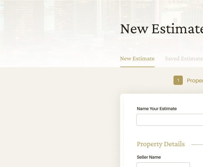
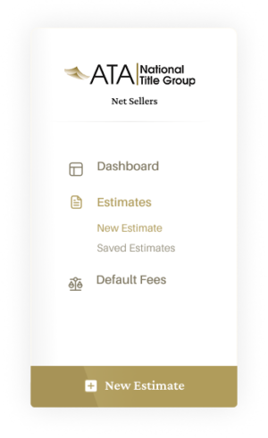
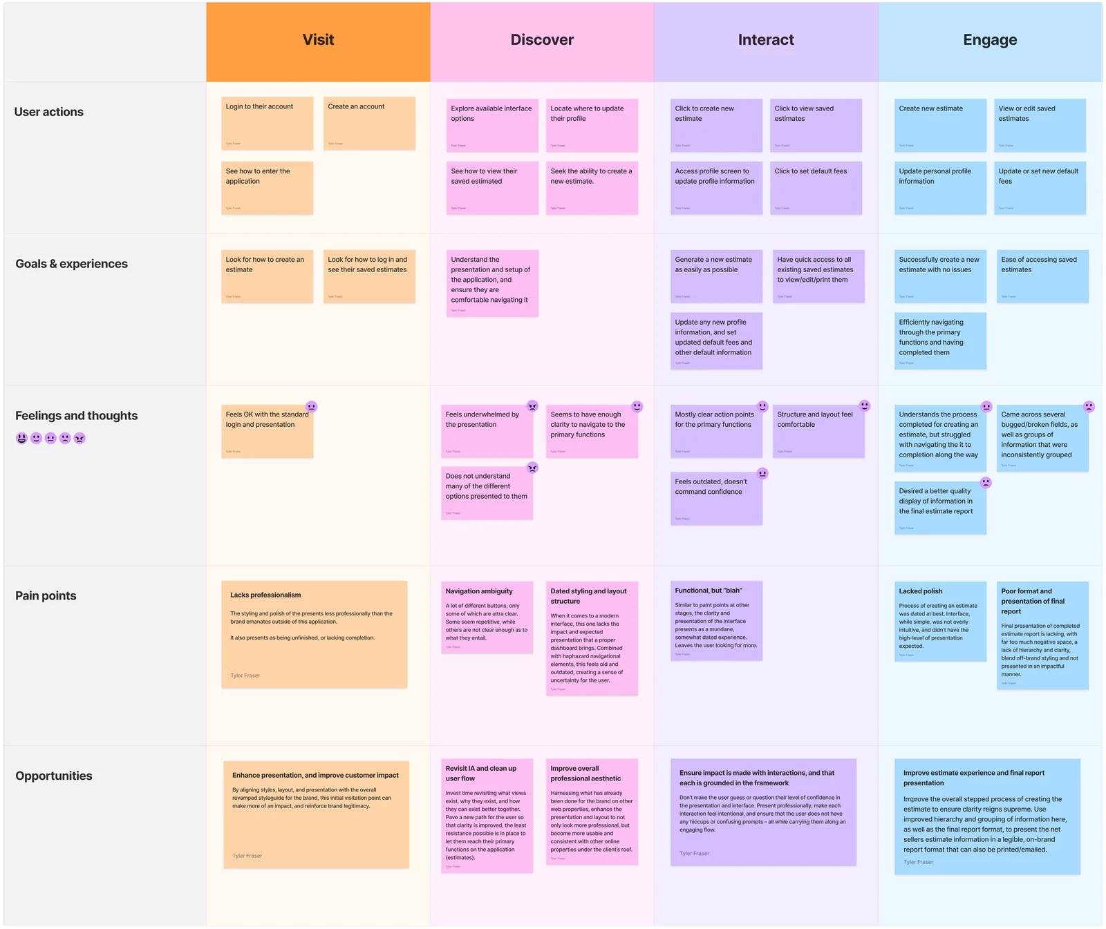
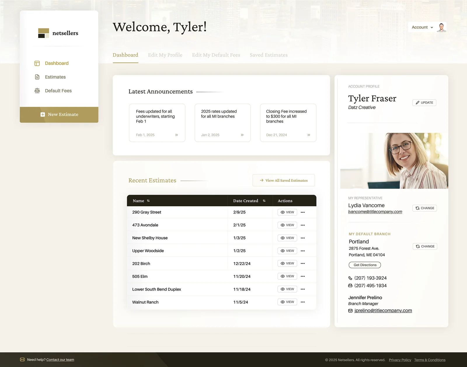
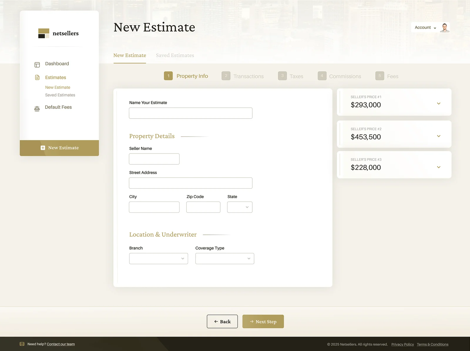
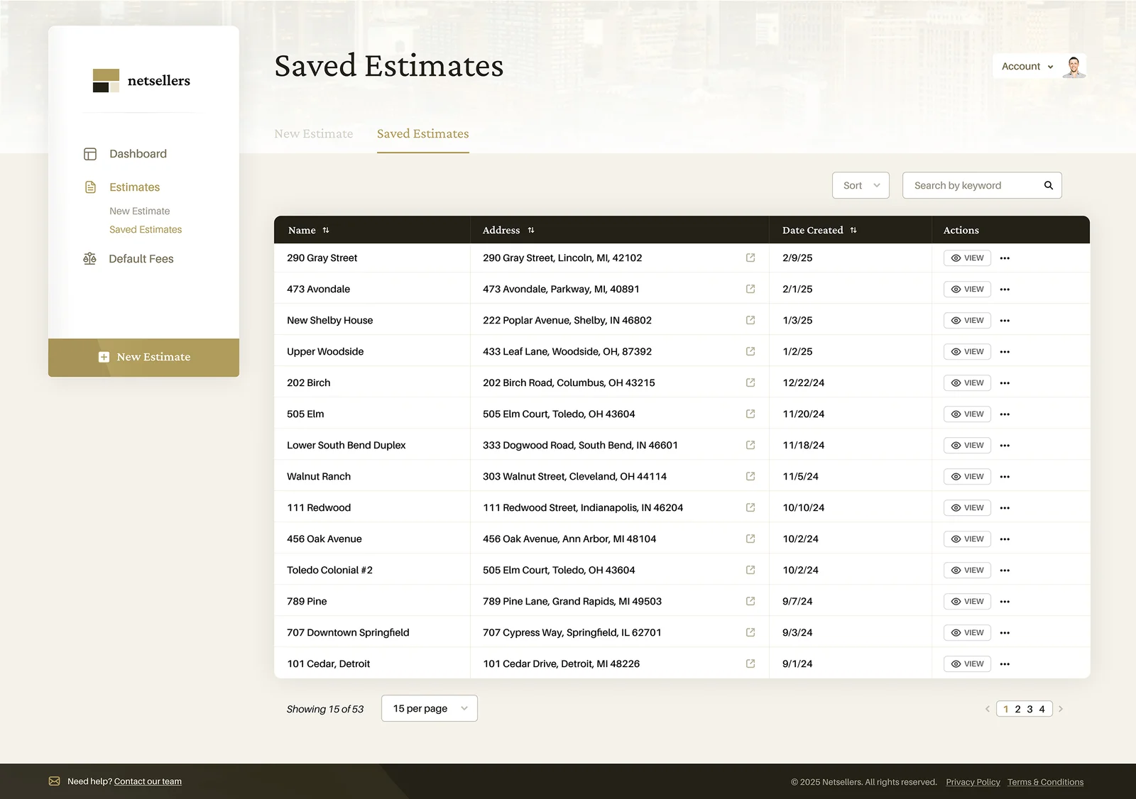
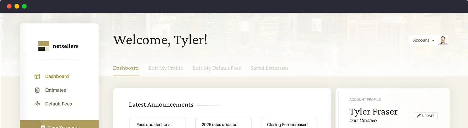
When a high-impact, long-standing client agrees to rebuild a highly utilized software application, you jump at the chance. I was offered to design a heavily-trafficked net sellers calculator for a national title insurance agency, in an effort to improve its presence, bring it up to a modern standard, and ensure that the user had an extremely improved experience.

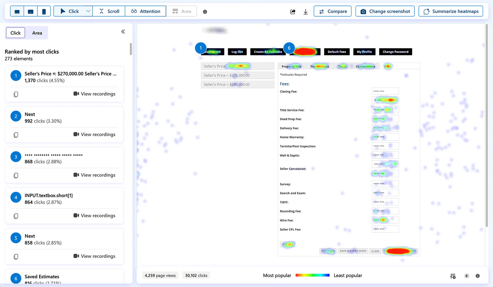
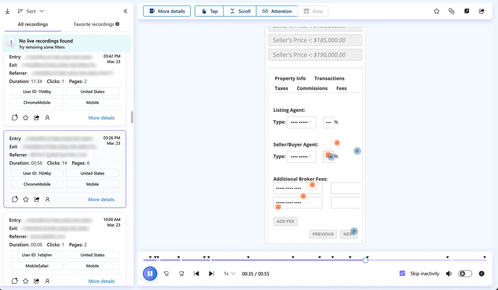
Using a combination of existing user feedback, behavior analysis/heatmapping, and existing knowledge of proper web interface guidelines, I was able to create a dynamite upgrade that coincided nicely with a similar upgrade happening to all 10 of their public-facing websites.

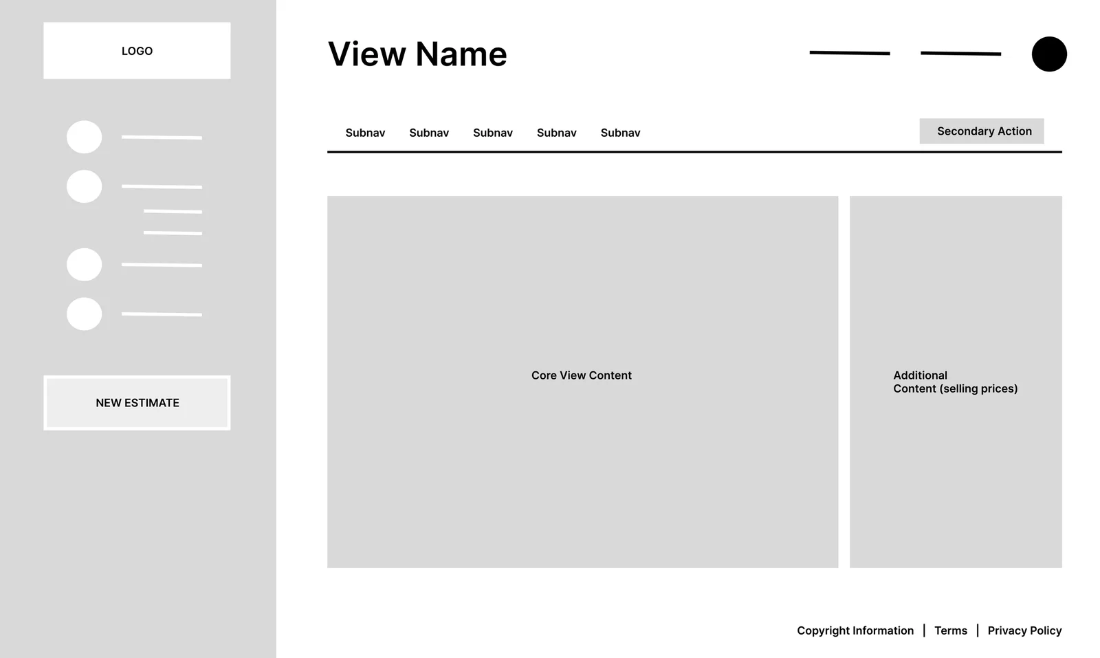
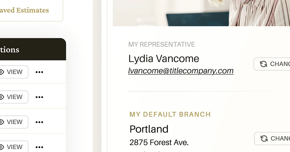
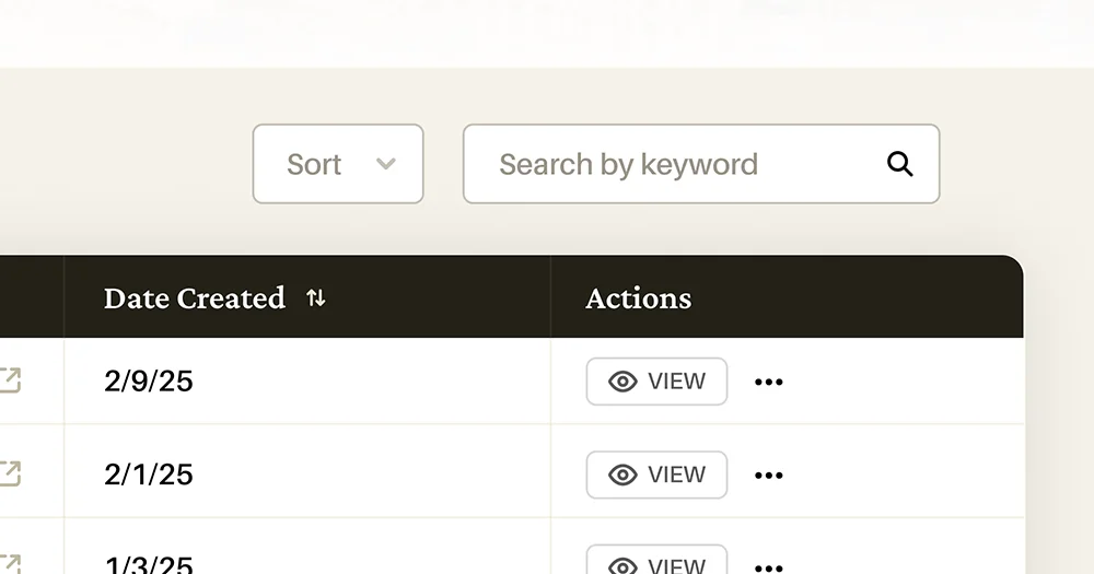
Take a look at my process, and the outcome of several screens below.

Project Intention

Improve and modernize

My intention with this project was simple in concept, but complex in practice: bring the existing platform up to speed with modern design approaches and improve the user experience – and within a sensible budget.

Don't alienate the user

The most critical part of this project was to not lose the user in the “upgrade” process. I needed to keep the familiarity of structure, so that the user could seamlessly transition with a minimal onboarding as possible.

Make it beautiful with function

I wasn’t engaged to win an award for an over-designed piece of art. This interface needed to be just as functional as it was aesthetically pleasing, so I set my tone and standards appropriately right off the get go.

Enhance the experience

From the baseline mentioned in the last two points, I could then gracefully enhance and add additional improvements to the user – things like search, filters, and a clearer navigational structure than the existing application.

Outlining the actions

I began our project discovery with crafting a chart of standard user journey, as well as including pain points provided by real users. For the scope of this project, it allowed us to combine real feedback with internal company definitions and solutions.

Defining user flow, options and feedback as part of the user journey

Evaluating user behaviors

In combination, I implemented behavior analytics tracking so that we could gauge the interactions and behaviors of real users as they normally would use the software. Heatmapping to track clicks and area of view, anonymous screen recording to examine on-screen user behaviors, and event-driven action tracking helped identify both pitfalls and opportunities alike for this overhaul.

Heatmap click tracking

Anonymous screen recording for analysis

Utilizing data to wireframe

Based on the chart of defined user options and flows, as well as feedback secured from my behavior analytics implementation, I crafted wireframes for three primary views (Dashboard, Saved Estimate, New Estimate) in order to define the primary structure of the application layout, as well as the variance in elements and presentational setup of the key components (the estimation process). This aided in further envisioning how the user’s process would play out, and opened additional opportunities for enhancements before the high-fidelity concepts were created.

Base dashboard wireframe

Challenges

Finalizing the interface

The completion of my wireframe process led to creating the final interface. The focus here to was to keep the visual aesthetic on-point with a parallel website branding project that was taking place, while ensuring that usability and functionality was crystal clear. The result was a happy balance of modern, professional presentation without making users that were familiar with the existing application uncomfortable. The client was quite pleased with the results, as was I.

Closing Thoughts

What would my next steps be if I continued design?

  • Craft further views to continue solidifying the implementation of the style and function for more elements within the software
  • Outline a handoff guide for design-to-dev, mapping key styles, variables, and expectations to the development team so that they could interpret and implement all intended aesthetic expectations efficiently.
  • Implement snapshot captures of usage statistics for the existing application in order to gauge effective changes between versions.

What would I have done differently, given further scope/budget?

  • Invest more deeply in user testing, spending time on individual user interviews and observing real-time behaviors from their responses, as well as walking through a curated scenario to ensure I received data about the aspects that I wanted to improve
  • Went further into prototyping, creating transitions between views, illustrating hover/call-to-action animations, showcasing intended functions between and adding to the implementation guidelines that could be handed off to development.